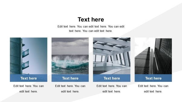
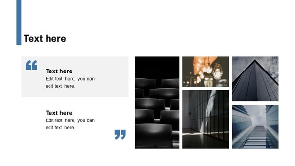
How many pictures do you use in slides?
In general, the answer is,.. less is better! You don't want to attract the attention of your audience towards the pictures on your slides. The pictures have to support your story, not distract the listeners' attention. However, a couple of pictures, three or even more pictures in a slide can be also harmonious, and stylish, as long as they match well in your presentation and if they are placed appropriately. It will make your presentation even stand out more.
|
Let's start big!
|
 |
|
|
|
|
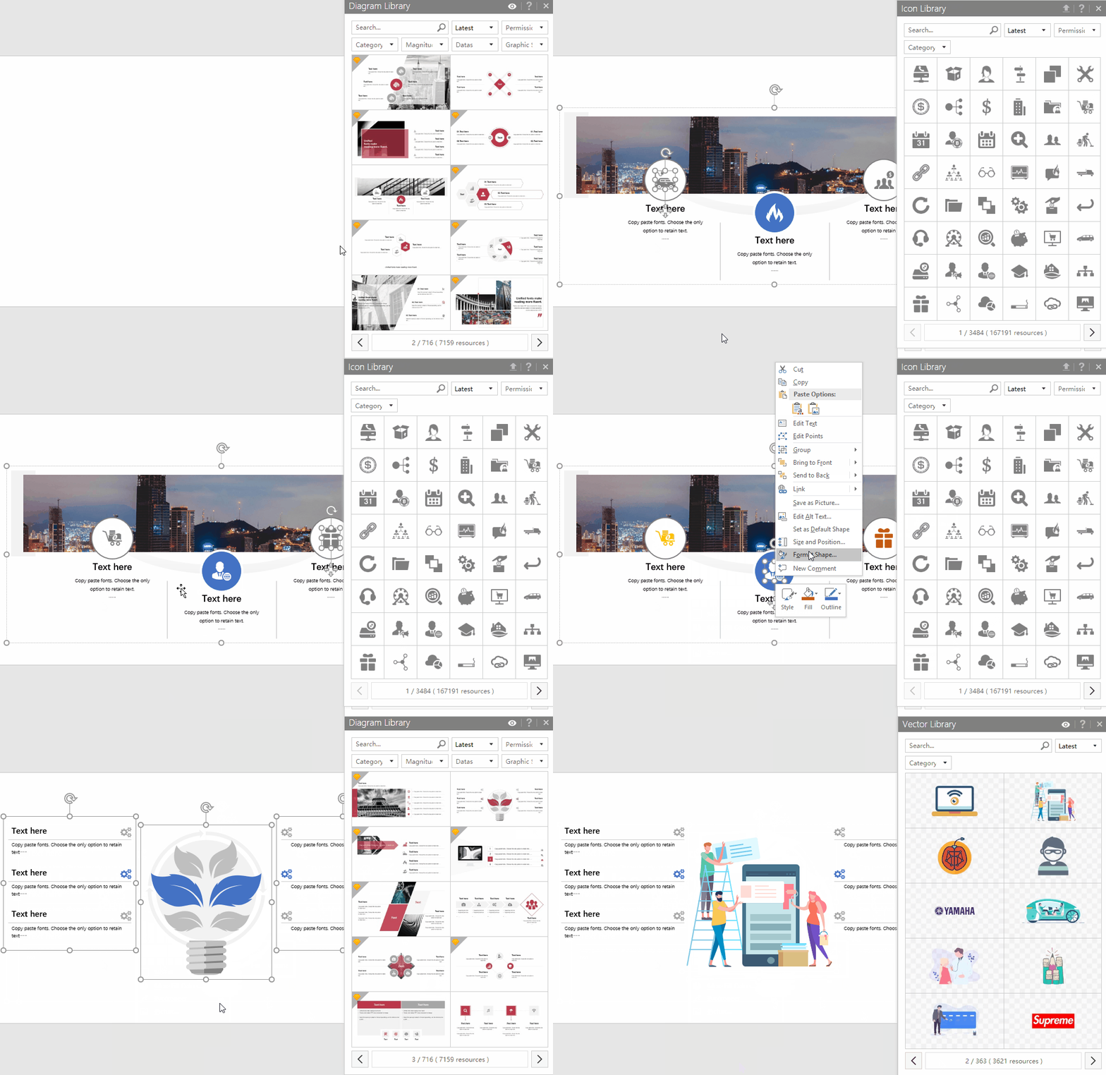
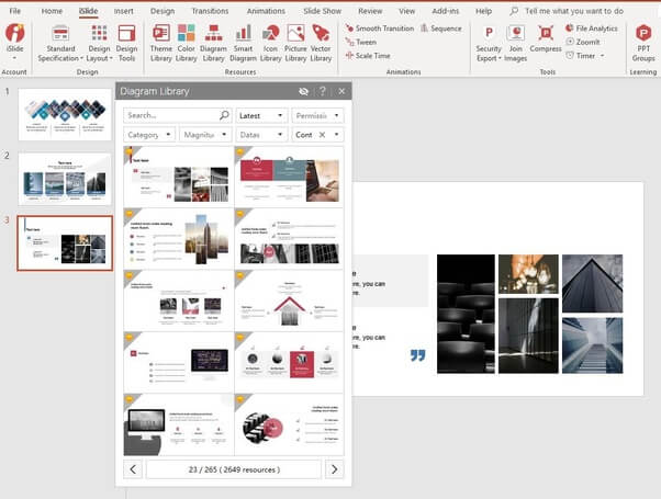
All the above examples are created and downloaded from the iSlide PowerPoint add-in. iSlide contains 305K+ build-in PPT resources, all sorted, indexed and searchable for you in handy libraries. There are libraries for themes, pictures, diagrams, slides, icons, vectors, colors and more. |
 |
|
|
Customizing a slide !
|
The iSlide add-in contains lots of other handy features and functions to let you create better and more creative presentations in less time. The layout and chart functionalities all come with handy scrollbars, showing you directly the effect on your slide as you move it. The iSlide add-in is free software(all the features and basic resources are free to use). But it offers Premium subscription option for users who need to access Premium resources.
For your information, iSlide has around 305K+ resources (145K+ FREE resources and 160K Premium resources). If you are not a heavy PowerPoint user, you can just download and use it for free. If you use PowerPoint a bit more regularly, we advise you to purchase the monthly or yearly Premium subscription, so you can enjoy all the high-quality Premium resources as well. The price is very reasonable, and you have earned it back in the time that you create 2 presentations.
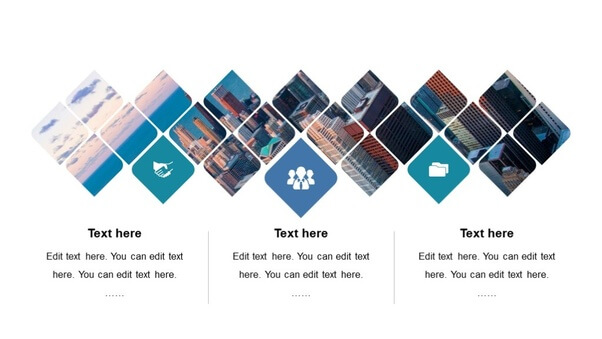
When it comes to more pictures in a single slide, check out some of the iSlide diagrams, because it actually can look good!


